 7
7Like many stargazers, I refer frequently to the World Atlas of the Artificial Night Sky Brightness, more conveniently called the Light-Pollution Atlas. I use it to seek out dark sites for deep-sky observing and also to compare my own experience with that of other people who live too far away for me to visit.
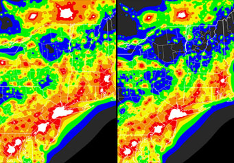
Here are two light-pollution maps of the Northeast stretching from Washington, DC at bottom to Montreal at top. The one at left was based on satellite observations with snow on the ground, while the one at right was snow-free.
David Lorenz
By the admission of its own homepage, the Light Pollution Atlas has many failings. That's nothing to be ashamed of considering what it achieved. In one fell swoop, we went from a situation where light pollution had been measured at a handful of scattered locations in a few countries to having a map covering essentially every inhabited spot in the world.
The assumption has always been that whatever the failings, observing conditions in (say) the red zone — the second brightest — were roughly the same everywhere. But several people had cast doubt on this assumption for various different reasons. Subjective descriptions of red-zone conditions in the U.S. Southwest seemed systematically worse than descriptions of red-zone conditions in the Northeast by equally experienced observers. A year ago, I noted in a blog that the light-pollution blobs for some northern cities seemed implausibly big. How could Montreal possibly have the same amount of light pollution as Los Angeles, a metropolitan area nearly five times as big?
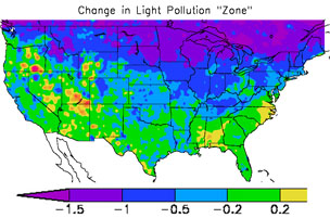
In the newly calculated atlas, the northern U.S. averages a full zone darker than in the old. That corresponds to a 3-fold reduction in skyglow.
David Lorenz
In a recent post in Cloudy Nights' Light Pollution Forum, David Lorenz published data that very strongly suggest that the original Light Pollution Atlas was systematically biased by the fact that snow was on the ground when the underlying satellite measurements were taken. Lorenz recalculated the light pollution for the U.S. and southern Canada based on snow-free satellite observations, and the whole northern part of the area came out roughly one full zone darker. That means that the original atlas overestimate the skyglow in this area by a factor of three.
Data from Lorenz's new atlas correlate much better with my ground-based measurements. To see the complete maps, visit David Lorenz's website.

Comments
Pete
July 15, 2010 at 3:35 am
What this really tells us is that snow cover is a major contributing factor to light pollution. It doesn't mean that one location (or set of locations) is now "better" than previously thought if you choose to observe from there when there's lying snow.
Since we're not in the business of making value judgements, just trying to find the best spots to observe from, it's still valid to know that the old maps reflect the situation at some times of the year. David's work is obviously valuable and adds to our knowledge, the question is how to assimilate the seasonal variation in limiting magnitude into the charts.
You must be logged in to post a comment.
Tony Flanders
July 15, 2010 at 4:21 am
I don't entirely agree with the previous comment. Fresh snow does indeed increase skyglow, but not by a factor of three (I've measured it). Snow reflects a lot of light straight up, where it escapes into space and is measured by the satellites. The real damage comes from light going horizontally or at low angles, which is scattered back down to the ground as skyglow but is relatively invisible to the satellites. Put another way, the original study correlated skyglow with satellite readings based on snow-free ground. That correlation does not hold if the ground is covered with snow.
You must be logged in to post a comment.
David Lorenz
July 15, 2010 at 8:28 am
At first sight, it may appear that you need both atlases: one for when there is snow and one for when there is not snow. But in fact the original atlas over-estimates the light pollution when there is snow as well.
In the context of the model used to calculate the original atlas, you can calculate how much the original atlas is over-estimating the effect of snow. I've now added a link which describes this in detail:
http://sites.google.com/site/3davel/home/light-pollution/bias
You must be logged in to post a comment.
Alin Tolea
July 15, 2010 at 3:11 pm
Though David Lorenz's work is very valuable, both the Light Pollution Atlas and his updated model are based on 1997-2001 data.
I would welcome an updated atlas based on newer data, as DMSP has publicly available data from 2009, as well as newer census data (2000?). I'm afraid that the gain shown above partly erased by development in some previous dark locations. I have firsthand experience with such a location in WV, where in only two years, the sky has gone from 21.5 m/sq arcsec to 21.3/m sq arcsec (as measured by the same Sky Quality Meter -L device.
It is of little consolation to most of us that "red" zones were in fact "yellow" 9-11 years ago.
You must be logged in to post a comment.
David Lorenz
July 16, 2010 at 9:33 am
Yes, more recent data would definitely be more valuable. Unfortunately there are at least two problems with using the more recent DSMP data: 1) as far as I'm aware all the newer data is saturated in urban areas (the orignal data and the more recent 2001 data, on the other hand, include observations when the satellite's gain setting is reduced so that you can see how bright the urban areas are), 2) The newer data are annual composites so you now have the snow problem (so, in some areas, the recent winters with heavy snow could make there appear to be a trend in light pollution even if there were none).
You must be logged in to post a comment.
Alin Tolea
July 16, 2010 at 1:32 pm
I was not aware of the potential problems. Would it be possible to include both old and new data? My guess (and it's only a guess) is that bright urban data did not change much, as opposed to lower intensity lights now present in previously dark areas. Though I don not doubt people observe from "yellow" to "red" skies, a lot of people use the Atlas to search for pristine, "blue" to "black" skies. This is where I see the most value for the data, and newer could be better for that.
You must be logged in to post a comment.
snowstargazer
July 16, 2010 at 2:18 pm
I do most of my night sky viewing from Maine and Nova Scotia. Snow cover is "the best" for viewing, not harmful at all. The low temperatures generally bring dry air. Even if relative humidity were the same, absolute humidity is always much lower and the stars are sparkling clear. You know how the water vapor makes the nearby hills fade on hot, humid, hazy days.
Further, with snow cover on everything there is little or no dust in the air to scatter light.
The worst problem is that the temperature tends to drop all night, and it's hard to keep a heavy telescope mirror at ambient temperature to prevent air density differences at the mirror's surface. Best viewing is generally towards dawn.
Very interesting article, I always found the map very inaccurate in my area, I could see more than than it indicated, now I know why. 🙂
You must be logged in to post a comment.
You must be logged in to post a comment.