 0
0Proper color balance is the foundation of a good-quality color image.
Richard S. Wright Jr.
In my very first blog here (has it really been two years already?), I said that one of my goals was not to become bogged down in “clever processing tricks.” Instead, I would stick to advice on obtaining good data, as good data is much easier to process.
But there are also some fundamentals about image-processing, beyond just image-calibration, that are useful to introduce — and they are far from “clever tricks.” These techniques are fundamental, and you should apply them regardless what software you are using. One of these techniques is balancing the color in your images.
I have said before that color imaging is an advanced topic, so beginners should start with black and white. I know that everyone wants bright, colorful images, so they jump right into that kind of imaging, but people also want cake for breakfast. Learn to capture monochrome data, so that you can calibrate, stack, and stretch one color channel at a time. Only then should you move on to color, multiplying the challenge by three — balancing color between the three channels as well.
Why We Need Color Balance
Richard S. Wright Jr.
Regardless of whether you start with a one-shot color camera or a monochrome camera, combining separate red, green, and blue exposures, you can end up with a calibrated and stacked color image. But without some additional help, there will usually be a very strong red or green color cast to your image.
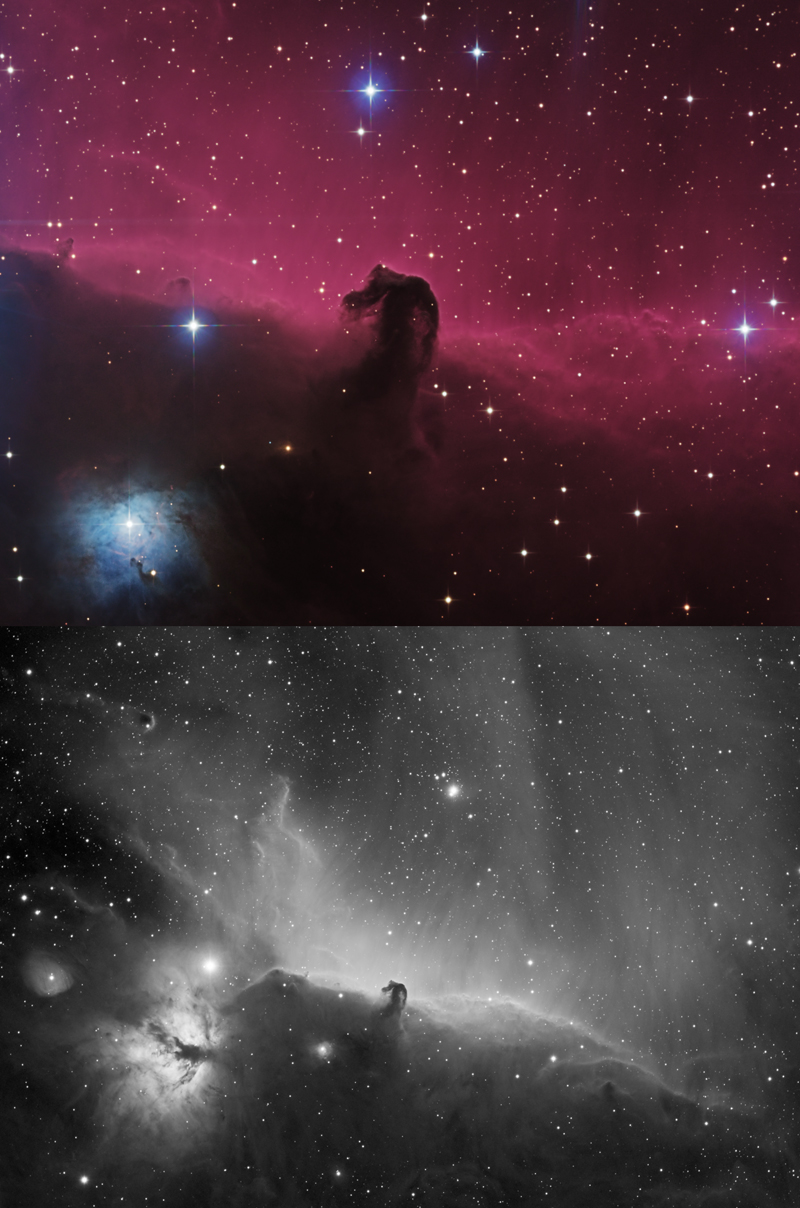
This color cast is why I become frustrated with people who say “just show me what came out of the camera.” I remember the first time I ever imaged the Horsehead Nebula from my back yard: The image came out all green, and I gave up, thinking something was wrong with my camera or software. Nope, that’s what it looks like “right off the camera.”
Unlike modern DSLR cameras or camera phones, which make color-balance adjustments for us, we have to do a lot of manual adjustments when we use an astronomical camera. Even if you’re shooting with a DSLR, the internal adjustments your camera makes are designed for daylight photography.
So, now that you have your final stacked image in your favorite post-processing software, it's time to deal with the image's color balance.
Let's Get Started
If you’ve followed my advice about starting with monochrome, you'll know how to adjust a single-channel images' contrast and brightness using the Curves or Levels tools in your favorite post-processing software. You’ve probably also mastered noise control as well, but with color, you’re going to discover that each channel brings its own noise challenges. Blue, for example, tends to have a weaker signal from most targets and thus a lower signal-to-noise ratio.
The key to good color balance is to adjust the three histograms together so that areas in the image that are neutral actually appear neutral — without too much red, green, or blue. Other terms for this process are white balance, background neutralization, or gray balance.
Richard S. Wright Jr.
How do we know what is neutral and gray in a color image of a deep sky object? Typically, we’ll use the sky background as the standard, but there are other techniques as well. You can adjust the histograms manually to line up the left sides and even out the distributions, for example. Or, some programs will use certain stars that they know are white (well, white compared to our Sun) as a reference point — or even a galaxy, assuming that most galaxies on the whole emit white light.
In Photoshop, you can use the Curves tool to manually select a neutral area. The tool will then adjust the curves of the individual channels to balance it out.
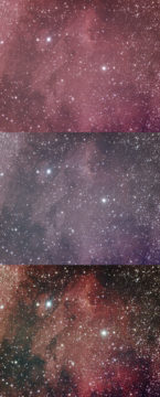
At right you can see the early stages of progression of the Pelican Nebula, an area rich in red, hydrogen-alpha emission nebulosity. While the nebula itself is red, the image is also highly red-shifted. Selecting the darker areas around the nebula, we can balance the image a bit better. Curves can darken the background and brighten the nebulosity.
If you decide to give the red areas a little "push", though, don't use the color balance tool, or the Curves tool. Use a tool in your favorite post-processing program that will target the red areas specifically. Otherwise, you'll again throw off the neutral areas.
While I can’t teach you to color balance in a blog, I do hope I've enlightened you a bit as to the foundation of color. This is where I pass the ball on to imaging gurus like Warren Keller and Adam Block.

Comments
vitozilla
January 24, 2020 at 9:07 am
Very timely discussion for me! I appreciate your moments of reality and humbleness, showing how an expert was once frustrated over their data as well. You reminded me to get back to the fundamentals, and more importantly, there is still hope!
You must be logged in to post a comment.
Jean4ST
January 24, 2020 at 5:33 pm
If you are using Pixinsight, you can calibrate your color data with the Photometric Color Calibration tool. It will platesolve your image (provided that you enter the coordinates of your object, the focus length of your imaging scope and the pixel-size of your camera) and compare your image to one of the professional astronomical databases and correct your image white point in order to obtain the correct colors for the stars and background. This is done in the linear phase of the image processing.
You must be logged in to post a comment.
You must be logged in to post a comment.